Websites for associations: 5 reasons to opt for an experienced digital agency

Websites: How your association meets the world
Your association website is your first impression. It’s how your association interacts with the world and a powerful website will foster great connections. You want your website visitors to be immediately impressed by a clean and modern design and be able to find what they’re looking for with little effort. Alternatively, if your website’s design is outdated and information is hard to find, there’s a good chance you’re going to miss out on these valuable connections. Nowadays, people have much less tolerance for websites that can’t provide them with the information they’re looking for. They’ll simply click that tiny “x,” move on and never look back.
The reality is that it can be challenging to know where to begin when redesigning a website. As an association professional, you have a mountain of priorities and becoming a web designer likely isn’t one of them. But the good news is there are reputable web agencies out there, like Industrial, with decades of experience. Hiring a respected web agency is a worthwhile investment that will save you loads of time, money, and trouble.
Finding a reputable agency with experience designing websites for associations is even better. Associations have very specific needs – they likely need a member portal, maybe an e-commerce component to purchase and renew memberships, or an event management solution to support an annual conference. These can all be quite complex to an agency or individual unfamiliar with the ins and outs of an association model. But for a web agency that has worked on dozens or even hundreds of similar briefs, they’ll be able to recommend the best solutions and implement them confidently.
Read on to learn five of the main reasons why you need a reputable agency in your corner.
1. Understand project goals for your association website
Let’s face it, a new website is a big project. Many associations looking to build a site may not appreciate how big of an undertaking it can be from the get-go. That’s because a good website makes it look simple, and a well-designed site can include a surprising amount of information packed into a modern and visually appealing package.
Building a website that includes everything a curious user might want to know is an overwhelming experience for a less-experienced designer. A team of experienced professionals can save you time by working closely with you to deeply understand your goals.
A professional digital agency will take the time to understand your specific needs and apply what they find to your website design.
UX (User Experience) researchers and designers are somewhat obsessed with creating a website that speaks directly to users and provides a frictionless and enjoyable experience, which keeps them glued to the site. UX researchers and designers are the bridge between clients and technical experts. They make sure sites are functioning so that users don’t get frustrated or give up.
Exercises they work on include:
- Content Strategy. This is geared toward ensuring the content (i.e., the site’s information) and potential site users are a good fit. That could mean deciding on a text or graphics approach, what role audio and video might play, and how to make it all usable, accessible, and (most of all) helpful to users.
- Analytics Research. This includes looking at data, which can be mined to answer questions about what’s working, what isn’t, and who the site’s reaching. It involves a systematic look at meaningful patterns in data and how those patterns can be changed or exploited.
- User Research and User Personas. This involves looking at the target audience for your site and working with test participants, asking them to work through specific tasks, and asking questions about their experience to see what can be improved. A user persona is an archetype generated by the design team based on research, which represents your target or ideal customer. It can help you market better or refine the website design to meet this audience. For example, a site geared toward millennial women will have different design choices than a site geared toward male boomers.
- Process Maps and Decision Trees. These both allow for simple graphical representations of a website’s user flow to ensure the site will work as intended. Before building the site, you can see where the user’s clicks and decisions will guide them and how one choice will influence the next. It can also expose gaps in the website’s flow and places where richer content is needed.
- Information Architecture (IA). This involves determining how the information contained in a website will be organized, labeled, navigated, and searched for. It outlines the path a user will take from the start to the intended goal.
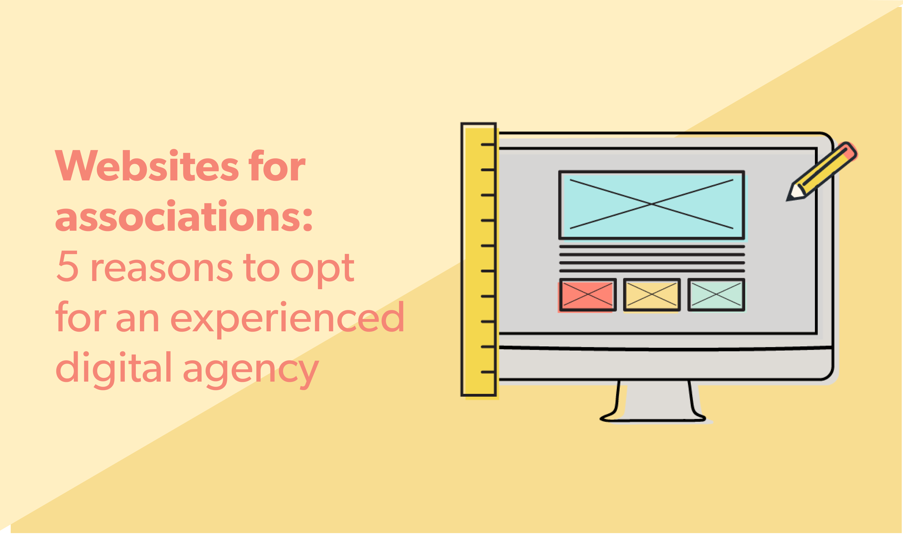
- Wireframing. Wireframes demonstrate the functionality of a page and are used to establish the page’s basic structure before visual design and content are added. Concept, styling, color, and graphics are intentionally kept to a minimum; they are typically grayscale with placeholders used for images and text.
There’s a lot that goes into creating a polished, user-focused website – a healthy balance of technical and artistic skills is required. Users who spend hours online may not be aware of the hours and depth of knowledge that goes into the production of a top-notch website. But that’s the aim: to render all work invisible and provide the user with a naturally seamless experience.
They’ll still appreciate the thoughtful interface, ease of navigation, and quality of content within.
2. Expert recommendations, new ideas, and fresh insights
An experienced web agency has resources that less established agencies and contractors wouldn’t have the same access to. They can:
- Leverage a professional UX and design team. Instead of only having one individual to lean on, you have an entire team of professionals with unique expertise in user research, usability best practices, and design trends. They’re also up-to-date on industry trends, best practices, modern web design, technology and capabilities.
- Responsive design. The practice of responsive design recognizes that users expect different things from your site depending on whether they use it on their laptops, phones, tablets, or other devices. Responsive design ensures your site is dynamic and easy to use regardless of the device it’s used on.
- Position your website for growth. You need a site that can handle a high level of traffic and capabilities to scale. Suppose your association decides to add a new section to the website or engage in other offerings. In that case, you need a website that can easily accommodate those inclusions without disrupting its flow.
The purpose of an association website, after all, is to attract new members to your association and keep current members in the loop. A good professional agency will listen to all your ideas and needs and develop solutions to address and improve them because they’ve seen what works and what doesn’t. Your combined knowledge allows for rich collaboration.
3. Customization
When you sign on with a reputable web agency like Industrial, you have a team of web developers devoted to building your site and bringing it to life.
There are certain features your association website will require that aren’t available in DIY, out-of-the-box solutions. These may include:
- An easy-to-use but comprehensive member portal
- E-commerce capabilities if you want to sell goods and memberships through your website
- Learning management systems if you’re going to provide educational programs or courses through your site
- Ability to integrate with event management systems if you have an annual conference or a full calendar of events
- Ability to sign up for marketing emails and have this option tailored by group or interest
Working with experienced web developers gives you access to leading technology and the latest features. Agencies like Industrial use the world’s most popular content management system (CMS), WordPress. With WordPress, the sky’s the limit. It makes it easy to add content within a robust framework, so your site can blend high-end design with ease of access whenever you need to make updates.
4. Web accessibility and compliance
The web is for everyone, and undoubtedly, your association wants to be sure to include everyone in its online experience.
In today’s modern world, websites need to be inclusive and accessible to all, which includes individuals with:
- Blindness and low vision
- Deafness and hearing loss
- Learning disabilities
- Cognitive limitations
- Limited movement
- Speech disabilities
- Photosensitivity
Building a website that everyone can access requires a great deal of specialized knowledge and expertise.
The Web Content Accessibility Guidelines Working Group (WCAG) breaks down several recommendations for website accessibility. These include making content:
- Perceivable
- Operable
- Understandable
- Robust
Within these broad categories are requirements for making content readable and understandable, maximizing its compatibility with assistive technologies, providing alternatives for time-based media, and many other points that consider how a site will reach an audience without compromising access to any users. As you can imagine, this type of knowledge is very specialized and not everyone is familiar with the full particulars.
The WCAG grades sites according to how well they achieve the aim of universal accessibility. And it’s not just a matter of nicety. As of June 30, 2021, Canadian law requires all businesses and nonprofits with 20 or more employees to comply with Web Content Accessibility Guidelines (WCAG) 2.0 Level AA. Some common accessibility failures, as compiled by Industrial, include:
- Missing a “Skip to Main Content” button, which can be critical for hard of sight or non-sighted users who use a screen reader
- Improper language settings, which can frustrate screen readers
- Insufficient text and background contrast. For example, light text on a light background can make it extremely hard for visually impaired users to navigate your website.
5. Future support for your association website
Once your site is live, you’ll want to take comfort in knowing that if something goes wrong, you have a lifeline. Inevitably, websites will need occasional support and maintenance to ensure they work at the top of their game. These issues may include:
- Routine bug fixes to ensure optimal website performance
- CMS (content management system) and plugin updates
- Troubleshooting application or hosting issues when cloud services are interrupted.
- Module and plugin installations if you want to add functionality or new features to your site
- Training for new employees
By using the expertise and skill of a professional digital agency, you know you have support available if you run into any issues or need some guidance.
Get peace of mind and hire an experienced web agency
If your association wants a website that:
- Features exceptional functionality
- Provides a user-friendly experience
- Looks and feels modern, customized, and unique
- Makes use of current technology
- Supports quick and easy content updates
- Complies with all accessibility mandates
It makes sense to go with a reputable, experienced company. Wicket has a roster of digital agencies we work with regularly who know the space, requirements, and challenges that go into a fantastic website for associations. Contact us to learn more.


