Designing the Wicket UX framework
I’m at the client’s office for a “Day-in-the-Life” session. Day-in-the-Life is a type of user observation, but instead of watching a person use our product, I watch them peforming daily tasks.
Cass, my subject, is a multi-tasker extraordinaire. She has a hands-free-headset, which is a good thing, because the phone rings frequently. On top of that, she greets the flow of visitors through the front door, making sure they sign in and out of the visitor log. Couriers drop off packages and stop to chat.
As a key person in her association’s member services team, Cass handles questions and requests from a large membership of health professionals. She shows me the number of new messages in her inbox; already that morning, she has several fresh emails with questions about membership and insurance.
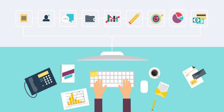
She has a multitude of windows and applications open, and navigates rapidly between them. Her hands are a blur over the keyboard and mouse as she shifts from one task to the next. At any moment she may be asked about membership dues, student discounts, maternity leave, insurance options, or college registration. And of course, she might have to do it in either official language.
I get the sense that for Cass, this is just a typical morning. But for me, this is inspiration.
This morning is a drop in the bucket of our UX research for Wicket. One of the goals of the research is to create a design framework for Wicket. Although “design” makes us think of the things you can see (colours, fonts, buttons), it goes deeper than that.
Design encompasses all of the deliberate decisions made when shaping an object or product. That wonderful quote from Victor Papanek captures the meaning of design beautifully,
Design is the conscious effort to impose a meaningful order.
The “meaningful order” we get to build is the Wicket user experience framework. Wicket will help people in organizations to manage membership data by allowing them to create, change, analyze and extract that data easily and on demand. Wicket will remove the painpoints for people, such as: cumbersome renewal processes, unpleasant user experience, low or no access to their data, unwanted and unnecessary features, down time, slow customization times, and job frustration.
With Wicket, we have had the very exciting opportunity to build an entire design framework from the ground up. And to do this, we have spent countless hours with real stakeholders and real users like Cass. In short, real human beings.
Designing for real people
A useful tool for the designer is the persona. A persona is a profile of a real human being to represent the end user of your website. It’s a fictional profile, but based (hopefully) on some real details. Inspired by True Events. We routinely use personas here at Wicket when designing navigation and user interface. It means you design for a person, rather than “the user”.
Wicket UX Design Principles
Wicket is more than a platform; it’s a vision to make membership data management better and easier. And when we say better and easier, we mean better and easier for the human beings who use it.
With our Wicket users in mind, here are just a few of the guiding principles we have used to build the Wicket UX framework:
CONSERVATIVE
Wicket is a tool that people will use frequently and for long periods of time. So we’re making the user interface fairly conservative. Colours are subdued, typefaces are familiar, and transitions are smooth. The Wicket user interface is well-dressed, soft-spoken and easy on the eyes.
BUT ALSO A LITTLE BIT SEXY
Conservative doesn’t mean it can’t be a little bit sexy too. Like I said, easy on the eyes. One of the painpoints we see in our research is that the old-school AMS monoliths tend to lack the modern niceties that we’ve become accustomed to. In this modern world of smartphones, touchscreens, and fun apps, people have come to expect slick interactions, responsive interfaces, and navigation helpers. Wicket does not disappoint.
USE THE REAL ESTATE
The Wicket user interface gets to stretch out and use some screen real estate. Around the edges, you’ll find your tools: things like a collapsible sidebar, contextual navigation, information tiles, and quick search. In the main area is where you’ll find the heart of things: the data and information.
THINK INTERMEDIATE
The person using the Wicket admin panel is very quickly going to become a powerful user of Wicket. That person is going to need access to sophisticated tools. He or she might start out as a beginner, but they won’t stay that way. So we’re designing Wicket to be easy to learn, but with powerful users in mind.
DON’T FORCE THE USER TO ASK
If a Wicket user needs to know something, our design principle is, don’t make them ask. We’re using our research to predict needs. For example, we know that member identification over the phone sometimes needs a series of questions. Name, email, phone, and if you’re lucky, membership number. Wicket makes sure that key information is at your fingertips, not hidden behind a dialogue window.
MORE THAN ONE WAY
Part of designing for a power user is knowing that someone who is proficient with a tool will quickly figure out different ways to get what they need from it. So Wicket provides multiple ways to trigger common tasks like creating an order or finding a person.
UX runs deep in Wicket
This framework of design principles help us to make decisions about user experience, user interactions and visual design. And of course, the user experience team shares the design framework with the development team; the design framework and the technical framework, together, contribute to the core vision of Wicket. User experience runs deep in Wicket, not just on the surface.
Finally, these UX design principles speak to the larger principles that guide Wicket. Wicket will take down the walls around your data and allow organizations to connect that data with the right applications. Those big-picture goals of access and connectedness inform the design process as well. When we’re wireframing a piece of Wicket on the whiteboard, brainstorming a micro interaction, or designing a colour palette, I like to think of how Cass is going to use it. I like to ask myself, How can we give her the access to the data she needs? How will we connect her with the tools she needs?

About Melissa
Melissa leads user experience design at Wicket. With her expertise in product interfaces and visual design, she has guided a broad range of organizations to creating highly successful products and web applications. Melissa is passionate about crafting the ideal user experience, maximizing user engagement, and designing clean, modern interfaces.